Chapter 15: Indirected Icons
In the last chapter we saw how to create simple icons containing text and sprites, but were limited by the twelve character restriction on the data field. The way around this, as was hinted at the end, is to use indirected icons instead of the simple icons which we have seen up to now. As we’ve seen, an icon’s data consists of 12 bytes which OSLib represents as a wimp_icon_data union:
union wimp_icon_data {
        char                    text[12];
        char                    sprite[12];
        char                    text_and_sprite[12];
        struct {
                char            *text;
                char            *validation;
                int             size;
        } indirected_text;
        struct {
                osspriteop_id   id;
                osspriteop_area *area;
                int             size;
        } indirected_sprite;
        struct {
                char            *text;
                char            *validation;
                int             size;
        } indirected_text_and_sprite;
};
In a non-indirected text or sprite icon, the twelve bytes of icon data are simply used to hold up to twelve characters of either text or sprite name:
char                    text[12];
char                    sprite[12];
char                    text_and_sprite[12];
Whilst this works, it’s quite restrictive and doesn’t allow for any complex messages to be displayed. There’s also another issue: just as with windows, it isn’t possible to change an icon’s definition after it has been created. This means that with a simple text icon, where the text is embedded in the icon definition, it isn’t possible to change the text once the icon has been created.
Indirected text icons
The difference with an indirected text icon is that the text itself is removed from the icon definition and placed into a separate buffer which is under the control of the application; a pointer to this buffer is then passed to the Wimp as part of the icon definition. Since the icon definition can’t change, the buffer must remain in place – and not change location or size – for the lifetime of the icon. It can be more than 12 bytes in size, however – and its contents can be changed at ant time by simply writing new text to the buffer.
To make use of this, we start by creating a global text buffer, using a char array. It can’t be declared locally within the win_create_icon() function, since this would cause it to be allocated from the stack and therefore disappear as soon as the function exits; instead, we’ll create it as global within the c.win file. We’re going to allocate 20 bytes, which is enough for 19 characters and a '\0' terminator.
#define WIN_ICON_TEXT_LEN 20

static char win_icon_text[WIN_ICON_TEXT_LEN];
With this buffer definition in place, we can now update win_create_icon() itself:
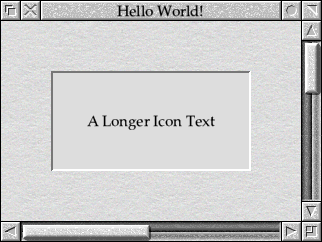
static wimp_i win_create_icon(void)
{
        wimp_icon_create icon_definition;

        icon_definition.w = win_handle;
        icon_definition.icon.extent.x0 = 100;
        icon_definition.icon.extent.y0 = -300;
        icon_definition.icon.extent.x1 = 500;
        icon_definition.icon.extent.y1 = -100;
        icon_definition.icon.flags = wimp_ICON_TEXT | wimp_ICON_INDIRECTED |
                        wimp_ICON_BORDER | wimp_ICON_FILLED |
                        wimp_ICON_HCENTRED | wimp_ICON_VCENTRED |
                        (wimp_COLOUR_BLACK << wimp_ICON_FG_COLOUR_SHIFT) |
                        (wimp_COLOUR_WHITE << wimp_ICON_BG_COLOUR_SHIFT);

        icon_definition.icon.data.indirected_text.text = win_icon_text;
        icon_definition.icon.data.indirected_text.size = WIN_ICON_TEXT_LEN;
        icon_definition.icon.data.indirected_text.validation = "";

        strncpy(win_icon_text, "A Longer Icon Text", WIN_ICON_TEXT_LEN);
        win_icon_text[WIN_ICON_TEXT_LEN - 1] = '\0';

        return wimp_create_icon(&icon_definition);
}
There are a few changes to the definition, starting with an increase in the x extent so that the icon spans from 100 to 500 OS Units. This will allow it to hold a longer piece of text.
We’ve returned the icon to being a simple text icon with the wimp_ICON_TEXT flag set, removing the wimp_ICON_SPRITE flag. We have, however, now included the wimp_ICON_INDIRECTED flag to make the icon indirected. As a result, the code following sets up the icon_definition.icon.data.indirected_text structure within the union. OSLib defines this structure as follows:
struct {
        char            *text;
        char            *validation;
        int             size;
} indirected_text;
The indirected_text.text pointer should be set to point to the text buffer that has been set up for the icon: we set this to point to the win_icon_text[] array. The indirected_text.size element contains the size of, or number of bytes in, the buffer – we can use the WIN_ICON_TEXT_LEN constant used to define the size of the win_icon_text[] array.
The other pointer in the data, indirected_text.validation, directs the Wimp towards something called a validation string. We don’t need this just yet, so we’re just supplying an empty string.
Finally we can copy a string into our icon buffer using strncpy(). With indirected icons, however, the Wimp always expects the buffer’s contents to be terminated so – just in case the supplied string was too long – we ensure that the last byte of the buffer is set to a '\0' character.
With the changes in place, the code should look that that found in Download 15.1. We’ve also taken the opportunity to expand the window’s visible area to display the full extent of the wider icon.
When compiled and run, the updated icons should look as shown in Figure 15.1.
Figure 15.1: Indirected text icons can hold longer messages
Changing the icon’s behaviour
So far, all of the icons that we have created have been ‘passive’ – that is, they haven’t interacted with the user. All icons have a button type, which defines how they behave – in a similar way to the icon colours, it’s specified by bits 12 to 15 of the icon flags:
#define wimp_ICON_BUTTON_TYPE_SHIFT     (12)
#define wimp_ICON_BUTTON_TYPE           ((wimp_icon_flags) 0xF000u)
The four bits allow for up to sixteen different types of button, and the Wimp defines fourteen:
#define wimp_BUTTON_NEVER               ((wimp_icon_flags) 0x0u)
#define wimp_BUTTON_ALWAYS              ((wimp_icon_flags) 0x1u)
#define wimp_BUTTON_REPEAT              ((wimp_icon_flags) 0x2u)
#define wimp_BUTTON_CLICK               ((wimp_icon_flags) 0x3u)
#define wimp_BUTTON_RELEASE             ((wimp_icon_flags) 0x4u)
#define wimp_BUTTON_DOUBLE_CLICK        ((wimp_icon_flags) 0x5u)
#define wimp_BUTTON_CLICK_DRAG          ((wimp_icon_flags) 0x6u)
#define wimp_BUTTON_RELEASE_DRAG        ((wimp_icon_flags) 0x7u)
#define wimp_BUTTON_DOUBLE_DRAG         ((wimp_icon_flags) 0x8u)
#define wimp_BUTTON_MENU_ICON           ((wimp_icon_flags) 0x9u)
#define wimp_BUTTON_DOUBLE_CLICK_DRAG   ((wimp_icon_flags) 0xAu)
#define wimp_BUTTON_RADIO               ((wimp_icon_flags) 0xBu)
#define wimp_BUTTON_WRITE_CLICK_DRAG    ((wimp_icon_flags) 0xEu)
#define wimp_BUTTON_WRITABLE            ((wimp_icon_flags) 0xFu)
Up to now we haven’t been setting the button type, which means that it has been zero – or wimp_BUTTON_NEVER which, as its name suggests, never does anything. Icons of this type ignore the user completely, which is ideal for things like labels in a dialogue box.
Many of the other button types require us to be able to process mouse clicks, which we won’t be able to do until the next chapter. However, one type of icon which the wimp will handle for us is a writable icon: a field into which the user can type. Making the icon writable is simply a case of amending the icon flags to include an appropriate button type:
icon_definition.icon.flags = wimp_ICON_TEXT | wimp_ICON_INDIRECTED |
                wimp_ICON_BORDER | wimp_ICON_FILLED |
                wimp_ICON_HCENTRED | wimp_ICON_VCENTRED |
                (wimp_BUTTON_WRITABLE << wimp_ICON_BUTTON_TYPE_SHIFT) |
                (wimp_COLOUR_BLACK << wimp_ICON_FG_COLOUR_SHIFT) |
                (wimp_COLOUR_WHITE << wimp_ICON_BG_COLOUR_SHIFT);
Setting the button type is done in a very similar way to setting the colours: the required value is shifted into position using the constants defined by OSLib. The modified code can be found in Download 15.2.
When compiled and run, the resulting window and icon will look exactly the same as they did in the previous example. However, clicking the mouse in the icon will cause it to gain the caret, which will then accept input from the keyboard as seen in Figure 15.2. Since we made the icon’s text buffer 20 bytes long by defining WIN_ICON_TEXT_LEN, up to 19 characters can be entered into the icon – the existing text can be deleted and replaced in the usual way, of course.
Figure 15.2: Icons can be made writable, so that the user can enter text
In normal use, the Wimp completely controls the user’s interaction with writable icons for us. This makes them a powerful way to manage data entry, since the application does not have to worry about making them behave in the correct way.
Validation strings
The other piece of information in the icon data, indirected_text.validation, is the validation string. So far, we’ve left this pointing to an empty string (""), but it can be used to dramatically alter the appearance and behaviour of the icon.
The string can hold one or more commands to the Wimp, given in the form of almost human-readable text. Each command takes the form of a single character between A and Z (or a and z, because they’re case insensitive) and can be followed by data. Without going into details yet, a validation string might be the letter L, which is an L command with no parameters; it could also be AA-Za-z, which consists of an A command followed by the data A-Za-z.
If more than one command is required, they can be separated by semicolons: Pptr_write;Kta contains the P and K commands with data of ptr_write and ta respectively. If you wish to include a semicolon in a command’s data, it must be ‘escaped’ by prefixing it with a backslash: \;. In total there are four special characters which must always be ‘escaped’ in validation strings: hyphen (-), semicolon (;), tilde (~) and backslash (\) should always be entered \-,\;,\~ and \\ if you need to use them literally. Because C also uses \ as an escape character in strings, they become "\\-","\\;","\\~" and "\\\\" if entered as literals in your code!
A full set of validation commands are listed in Table 15.1. There are a lot of different options, but we’ll introduce them over the coming chapters as needed.
| Command | Action |
|---|---|
| A | Allow Characters |
| C | Set 24-bit Colours |
| D | Display Mask Character |
| F | Set Wimp Font Colours |
| K | Assign Functionality to Keys |
| L | Format the Icon Text |
| N | Set Icon Name |
| P | Set the Pointer Shape and Active Point |
| R | 3D Border Commands |
| S | Sprite Names |
| T | Tinting Sprites |
| U | Unicode Character Limit |
| X | Disable Width Calculation |
| Y | Enable Features |
Table 15.1: The validation string commands
Unlike the icon text buffer, the contents of a validation string usually doesn’t change once its icon has been created. As with the text buffers, the string must remain in memory as long as the icon exists but, without the need to change their contents, specifying them as string constants in the code – as we’ll be doing here – will have the required effect without the need to define a global buffer array for each one.
Filtering input
When asking the user to enter data, a common requirement is to be able to limit what characters they can type. If an application is expecting an amount of money, for example, then limiting input to the characters from 0 to 9 along with . and - might be desirable. This can be done very easily in writable icons using the A validation command.
Our icon currently contains the text “A Longer Icon Text”, but since it’s writable the user can change this to anything that they can type at the keyboard: try deleting the contents and entering “0123456789”, for example. Suppose that we wished to restrict the user to typing the characters A to Z, in upper or lower case, plus a space? The answer is to set the validation string to include an A command with a suitable filter:
icon_definition.icon.data.indirected_text.validation = "AA-Za-z ";
The data which follows an A command is simply a list of allowable characters for typing into the icon. Since it’s not uncommon to need to specify whole ranges of characters, a dash can indicate a ‘range’ of characters – in this example the two sets of letters from A to Z and from a to z. Note the space at the end, to allow the spacebar to be used. If this change is made to win_create_icon() and the code compiled, then it will no longer be possible to type anything other than letters and spaces into the icon – try it and see!
What about if we wished to limit input to monetary values, as suggested above? This time we might wish to allow the user to enter a - character in case they have a negative amount to specify, but we’ve seen that the Wimp treats this as indicating a range of characters. The answer is as follows:
icon_definition.icon.data.indirected_text.validation = "A0-9.\\-";
To make sure that the - is recognised, we’ve ‘escaped’ it with a backslash – and because a backslash is also a special character in C strings, we’ve had to enter it twice to that the Wimp sees it once as we explained in the previous section. Again, compile this change and try it out!
This time, something slightly odd should become apparent. We’ve limited the valid characters to a set which contain the digits 0 to 9 along with - and . but the Wimp is still quite happy to initialise the icon with the contents “A Longer Icon Text”. The Wimp only applies the A command when the user tries to type into an icon, so as a developer we must always be careful to set icons up so that they comply with the restrictions that we’ve applied!
Another common requirement when filtering characters is to allow everything except one or two letters: a common example is that it’s not valid to enter spaces in filenames. Clearly it would be cumbersome to specify every character which was allowed, so we can use a ~ to negate options. Change the icon’s definition as follows, and suddenly it should be possible to enter any character unless it’s a space:
icon_definition.icon.data.indirected_text.validation = "A~ ";
The ~ is actually more subtle than this example suggests, however. If it’s the first character in the data, then all of the characters which follow it are disallowed: setting the validation string to "A~ ." would allow anything except space and full stop. It also allows characters to be disallowed from a previous range, however: the validation string "AA-Za-z~dpu" would allow the letters from A to Z and a to z, except for d, p and u (although D, P and U would be OK).
The character ranges are completely flexible, and there's no requirement to specify complete sets of characters. For instance, to restrict input to those characters valid in a hexadecimal number, the string "A0-9A-F&" could be used. This would restrict input to the digits 0 to 9, the capital letters A to F and an ampersand.
For completeness, the code for the first example in this section – where the icon accepted the letters A to Z, a to z and space – can be found in Download 15.3.
Behavioral improvements
If you’re familiar with other Style Guide compliant applications, you’ll probably have noticed that when the pointer passes over our icon it doesn’t change shape to indicate that clicking over the field will place the caret. This is something that all applications should do for their writable icons, as it gives a visual clue that the icon can take input and makes the desktop more consistent for users.
Fortunately it’s something that is very easy to implement, thanks to the P command. This takes the name of a four-colour sprite from the Wimp pool as its data, and causes the pointer to change when it passes over any icon for which it’s specified. The Wimp provides a number of standard sprites which an application should use for the pointer whenever appropriate, including one called “ptr_write” which applies to writable icons. If we update the validation string to be:
icon_definition.icon.data.indirected_text.validation = "AA-Za-z ;Pptr_write";
then not only will the icon only accept the letters A to Z and space, but the when the pointer passes over the icon it will change shape as the Style Guide requires. This can be seen in Figure 15.3.
Figure 15.3: Writable icons should change the mouse pointer when it’s over them
Another requirement, when entering passwords or other secure information, can be to mask the characters in the icon so that they can’t be observed by someone watching over the shoulder of the person using the computer. The D command allows a mask character to be specified, by including it as the data after the command. For example, to display an asterisk for each character in the icon, we could specify a validation string of "D*"; to use a dash, remembering that dashes need to be escaped in validation strings, we could use "D\-". The command also prevents the contents from being cut or copied to the clipboard where the Wimp supports such operations in icons.
Updating the validation string as follows should now replace the text in the icon with asterisks, as seen in Figure 15.4, whilst leaving the pointer change and filtering intact.
icon_definition.icon.data.indirected_text.validation = "AA-Za-z ;Pptr_write;D*";
Note that despite the display mask, the win_icon_text text buffer still contains the actual characters entered into the icon. This enables applications to handle the entry of passwords easily – although it’s worth bearing in mind that the ‘hidden’ information will still be in memory, and therefore potentially readable by malicious software.
Figure 15.4: A display mask allows the contents of an icon to be hidden
Changing the formatting
Up to now our icon has been resolutely two-dimensional, with a simple single-pixel border around the outside. Whilst this is the default, the RISC OS convention has been to use a 3D appearance in windows and dialogue boxes for some time now. This aspect of an icon’s appearance is controlled by the R command, which takes a numeric parameter indicating the kind of border which we require.
The seven effects on offer are shown in Figure 15.5, and cover the usual range of window components. Borders 1 to 4 are ‘static’ ones: the Style Guide encourages the use of border 2 for display fields and border 4 for grouping parts of a dialogue box together. Border 1 can be useful for creating things like column headings in tables; Border 3 doesn’t tend to be used that often. Although it isn’t obvious in a screenshot, borders 5 and 6 are ‘dynamic’ – they can be made to ‘click’ under the mouse, and are useful for things like OK and Cancel buttons. Border 7 was intended for writable icons, but never made it in to the Style Guide and so shouldn’t be used.
Figure 15.5: A range of 3D icon borders are available
To make use of a 3D border, we can start by returning the icon to a simple wimp_BUTTON_NEVER button type suitable for a display field. The backgrounds of 3D icons are always wimp_COLOUR_VERY_LIGHT_GREY – of course they can be other colours, but following the Style Guide is encouraged. This results in setting the icon’s flags as follows:
icon_definition.icon.flags = wimp_ICON_TEXT | wimp_ICON_INDIRECTED |
                wimp_ICON_BORDER | wimp_ICON_FILLED |
                wimp_ICON_HCENTRED | wimp_ICON_VCENTRED |
                (wimp_BUTTON_NEVER << wimp_ICON_BUTTON_TYPE_SHIFT) |
                (wimp_COLOUR_BLACK << wimp_ICON_FG_COLOUR_SHIFT) |
                (wimp_COLOUR_VERY_LIGHT_GREY << wimp_ICON_BG_COLOUR_SHIFT);
The icon’s validation string can also be updated. We no longer need to control the characters which can be entered by the user since the icon isn’t writable any more; similarly it should no longer affect the mouse pointer or use a display mask. This means that the A, P and D commands from the last section can be removed, to be replaced by an R command requesting a ‘type 2’ border:
icon_definition.icon.data.indirected_text.validation = "R2";
If these two changes are applied to win_create_icon() and the code recompiled, the result should be the window seen in Figure 15.6.
Figure 15.6: Using a type 2 border to create a display field
There’s one final change we can make before moving on to make our window and icon interact with the user. So far, the text that we’ve used has fitted into the width of the icon, but what happens if it doesn’t? First, increase the size of the buffer that we’re allocating near the top of c.win.
#define WIN_ICON_TEXT_LEN 100
With a bit more space to play with, we can now display a longer message in the icon:
strncpy(win_icon_text, "The Quick Brown Fox Jumps Over The Lazy Dog", WIN_ICON_TEXT_LEN);
If this code is compiled and run, the text is too long to fit in the available space and the result can be seen in Figure 15.7. The text is clipped to fit the available width but – even though the icon has the wimp_ICON_HCENTRED flag specified – the Wimp has right-justified the contents so that the end of the text is visible. This is intended behaviour: the aim is to ensure that the significant end of things like filenames remains visible.
Figure 15.7: The Wimp usually clips text to fit within the icon’s area
However, by using the L command, the Wimp can be made to wrap the text on to additional lines as required. If the validation string is updated to
icon_definition.icon.data.indirected_text.validation = "R2;L";
then the effect can be seen in Figure 15.8. By default, L takes no data; if the Nested Wimp is present, however, it can take a single number representing the required line spacing in OS Units. This isn’t often that useful; should it be required, we’ll find out more about the Nested Wimp in a later chapter. Support for text wrapping is fairly limited: it can’t be used in writable icons, for example.
Figure 15.8: Icons can be made to wrap the text within them
The code of this final example can be found in Download 15.4.
Window titles as icons
Back in Section 12.6 we glossed over two aspects of the wimp_window structure holding our window definition. Specifically, we noted that the following lines of code set up the window title, but didn’t really explain how they did so.
window_definition.title_flags = wimp_ICON_TEXT |
                wimp_ICON_BORDER | wimp_ICON_HCENTRED |
                wimp_ICON_VCENTRED | wimp_ICON_FILLED;
strncpy(window_definition.title_data.text, "Hello World!", 12);
With the benefit of the knowledge gained in this chapter and the last one, it should be obvious that this is a wimp_icon definition without the extent. In fact, window_definition.title_flags is a set of wimp_icon_flags, while window_definition.title_data is the by now familiar wimp_icon_data union.
Given that the title bar is embedded in the window, there are some restrictions on what can be done. The wimp_ICON_TEXT, wimp_ICON_SPRITE and wimp_ICON_INDIRECTED flags all work, but in practice etiquette dictates that title bars should never contain sprites: indirected and non-indirected text are the only sensible options. We can also set the wimp_ICON_HCENTRED, wimp_ICON_VCENTRED and wimp_ICON_RJUSTIFIED flags, but again convention says that a title bar’s contents should always be horizontally and vertically centred.
The Wimp treats the wimp_ICON_FILLED and wimp_ICON_BORDER flags as always being set: the bar must always be filled and have a border, whether or not the flags are included. The foreground and background colour fields in the flags are ignored, since the values are held in the wimp_window.title_fg and wimp_window.title_bg elements of the window definition structure. With the exception of outline fonts – which we haven’t yet met and shouldn’t be used in a title bar anyway – none of the other features of the icon flags will work in a title bar.
Since the title bar is only ever going to be a text icon in the majority of applications, its data will either be held in the window_definition.title_data.text[] array or the window_definition.title_data.indirected_text structure. These both behave in exactly the same way as for any other icon.
That’s it for ‘passive’ icons – in the next chapter we’ll begin to make our window react to the user. In the meantime, it’s a good idea to experiment with the icon code that we’ve met so far, to make sure that everything makes sense before we move on.
